To choose quartz that works with your cabinets, start with the cabinet's undertone (warm, cool, or neutral). Then decide whether the countertop should contrast with the cabinets or blend into them. After that, let one surface, either the quartz or the cabinets, carry most of the visual pattern so the two don't compete. That three-part rule of undertone, contrast, and pattern hierarchy resolves most pairing decisions before you ever look at a sample wall. The sections below explain how to apply each step. Whether you're keeping your current cabinets or replacing them, it helps to review countertops options alongside your cabinet finish rather than choosing each in isolation.
Step 1: Identify Your Cabinet Undertone
Every cabinet finish leans warm, cool, or neutral. That undertone matters more than the surface color name. A "white" cabinet can read creamy (warm) or bright blue-white (cool), and a quartz slab that looks great next to one can look dingy next to the other.
How to check your undertone:
- Hold a sheet of plain printer paper against a cabinet door in daylight. If the door looks yellow, beige, or peach by comparison, it's warm. If it looks gray, blue, or green, it's cool. If it looks neither, it's close to neutral.
- For wood and stained cabinets, look at the grain highlights. Orange, red, or golden tones are warm. Gray, ashy, or weathered tones are cool.
- For painted cabinets, check the paint manufacturer's color description if you have it. Terms like "greige," "taupe," or "linen" usually signal warmth.
Matching rule: Pair warm cabinets with quartz that has warm veining or a cream base, and pair cool cabinets with quartz on a bright white or gray base. Neutral cabinets give you the most freedom.
Step 2: Decide Between Contrast and Harmony
Once undertones are aligned, choose the relationship you want between the two surfaces.
High contrast
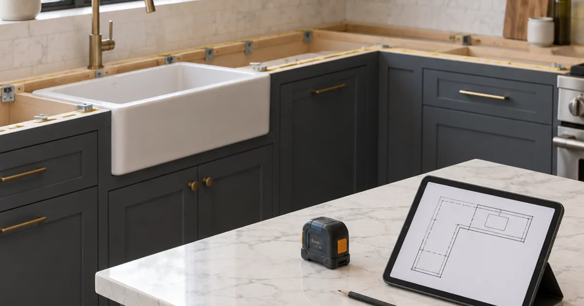
Examples include dark navy or charcoal cabinets with white quartz, or white cabinets with a dark gray or near-black countertop. Contrast defines the countertop edge clearly and makes each surface read as its own element.
- Works well for: Kitchens with plenty of natural light, simple cabinet door styles, and homeowners who want a crisp, graphic look.
- Tradeoff: Contrast emphasizes every seam, edge profile, and appliance gap. Dark quartz also shows dust, water spots, and crumbs more readily than mid-tone surfaces.
Tonal harmony
Examples include white cabinets with white or soft-gray quartz, or medium wood with a warm beige quartz. The surfaces blend, so the room feels calmer and often larger.
- Works well for: Smaller kitchens, bathrooms, and spaces where you want backsplash tile or hardware to provide the accent.
- Tradeoff: Too much sameness can look flat. If the quartz and cabinets are nearly identical in value (lightness), add texture or contrast elsewhere, such as hardware, a tile backsplash, or open shelving.
Quick test: Squint at a sample pairing. If the two surfaces merge into one blob, you have harmony. If they separate sharply, you have contrast. Decide which one you actually want before you shop.
Step 3: Set a Pattern Hierarchy
This is the step most people skip. Only one major surface should be "busy." The other should support it.
- Strongly grained wood cabinets (oak, hickory, rustic stained finishes) already bring movement. Choose quartz with a solid color, fine speckle, or very soft veining.
- Flat painted cabinets like a classic painted shaker door are a quiet backdrop. They can handle bold marble-look quartz with dramatic veining.
- Busy backsplash tile (patterned cement tile, zellige with heavy variation) counts as a pattern too. If your backsplash is the star, keep both the quartz and the cabinets calm.
Pattern scale matters as well. Large, sweeping veins suit long islands and big runs of counter where the pattern has room to read. Small, dense speckle suits compact bathroom cabinets and vanities, where a big vein might get cut off awkwardly by the sink.
Step 4: Match Quartz Style to Cabinet Door Style
Door profile hints at which quartz looks will feel coherent:
- Shaker and transitional doors: Very flexible. Marble-look, soft veining, and solid whites all work.
- Flat-slab modern doors: Solid colors, concrete-look quartz, and linear or minimal veining tend to suit the clean lines.
- Raised-panel traditional doors: Warmer quartz with gentle movement, or granite-look speckled patterns, often feels more consistent than stark, ultra-modern solids.
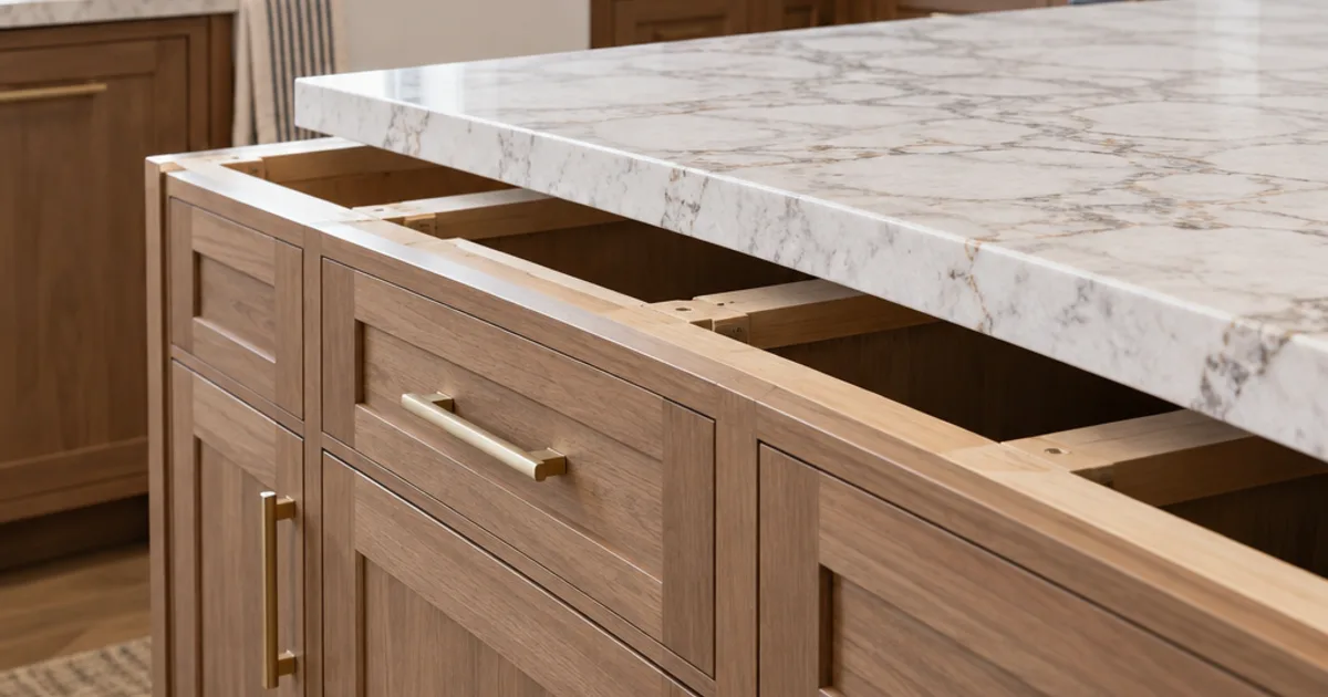
- Stained wood doors: Let the stain tone guide you. A medium or dark finish such as a shaker stain generally pairs better with quartz that has a cream or warm-gray base than with a stark blue-white.
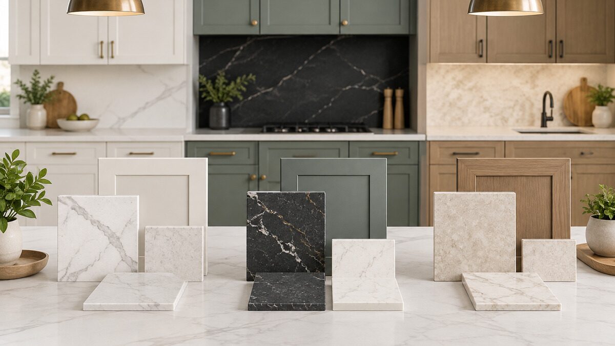
Step 5: Test Samples the Right Way
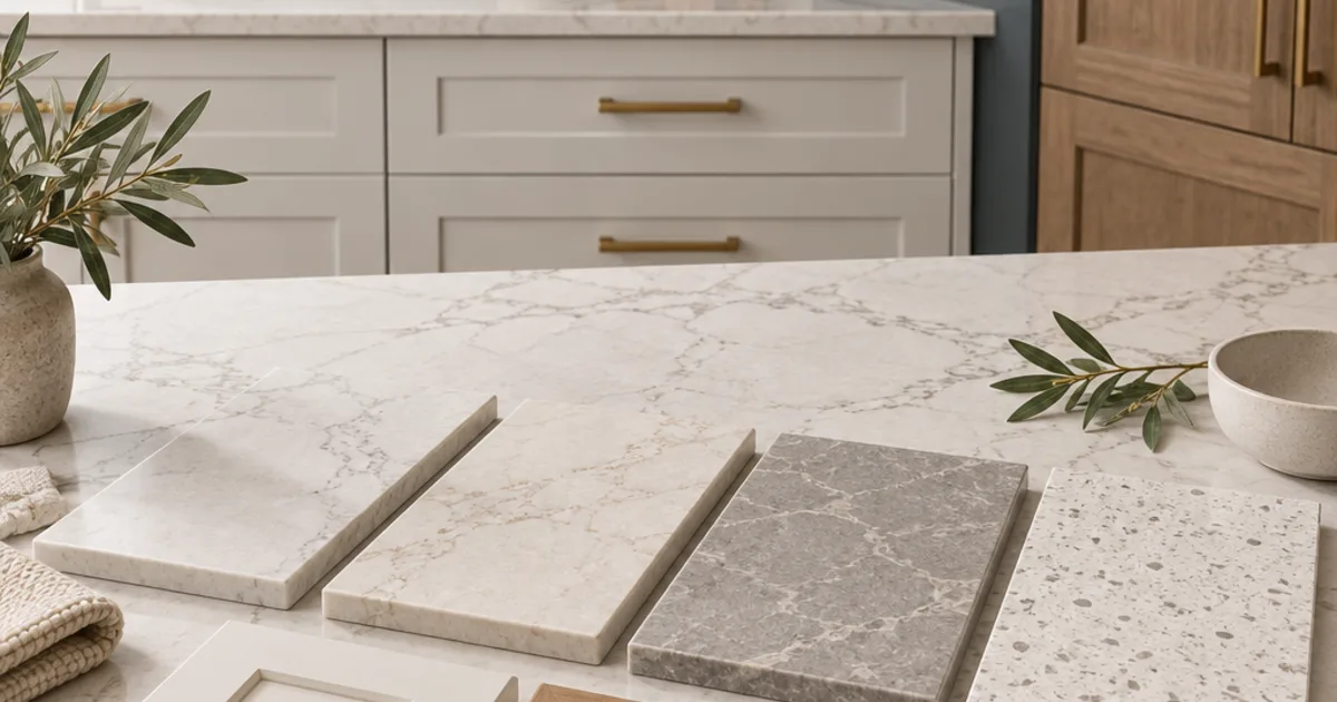
Small chips are misleading. Use these methods to get a truer picture:
- View samples in your own room at different times of day. Kitchen lighting shifts undertones noticeably between morning daylight and evening LED lighting.
- Lay the sample flat on or next to a cabinet door, the way you'll actually see it. Don't hold it vertically against a wall.
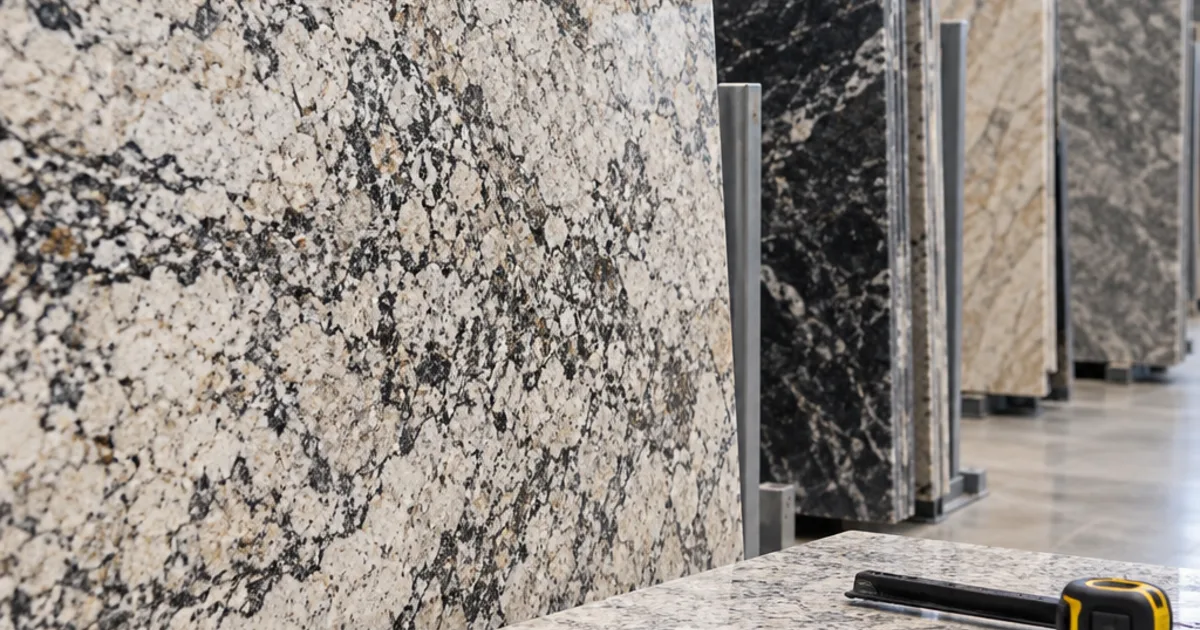
- Look at full-slab photos or the actual slab for patterned quartz. A 4-inch sample of a heavily veined design may show no vein at all.
- Include your other fixed elements: flooring, backsplash tile, hardware finish, and sink. The countertop sits between all of them.
Illustrative Example (Hypothetical)
This is a made-up scenario to show the decision process, not a real customer project.
A homeowner has medium-brown stained oak cabinets with visible grain and wants to update the countertops. They are drawn to a bright white quartz with dramatic gray veining.
- Undertone check: The oak reads warm and golden. The quartz base is cool blue-white, so this is a mismatch.
- Pattern check: The oak grain is already busy, and the dramatic veining would compete with it.
- Adjustment: They shift to a warm white or cream quartz with light, soft veining. The warm base harmonizes with the oak, and the subdued pattern lets the wood grain stay the focal point.
- Result of the reasoning: A cohesive pairing achieved by changing the quartz, not the cabinets.
Common Mistakes to Avoid
- Choosing quartz from a showroom display alone. Showroom lighting is often brighter and cooler than a typical home kitchen.
- Ignoring undertone because both items are "white." Cream cabinets next to stark white quartz can make the cabinets look yellowed.
- Doubling up on bold patterns. Busy granite-look quartz plus heavily grained cabinets plus patterned tile overwhelms the eye.
- Forgetting the island. If you plan a contrasting island color, test the quartz against both cabinet finishes.
- Picking extreme darks or pure solids without thinking about maintenance. Very dark and very uniform surfaces tend to show smudges and debris more than mid-tones with light pattern.
Frequently Asked Questions
Should countertops be lighter or darker than cabinets?
Either can work, but there should be a deliberate difference in lightness unless you want a fully tonal look. Lighter counters with darker cabinets tend to brighten the work surface. Darker counters with light cabinets ground the room. Whichever you choose, keep the undertones aligned.
Can I put white quartz on white cabinets?
Yes, as long as the two whites share an undertone. Ideally, the quartz has slight veining or texture so the surfaces don't merge completely. Adding contrast through hardware, a backsplash, or flooring keeps an all-white kitchen from looking flat.
Does the same quartz work in both the kitchen and the bathroom?
It can, but consider scale. A large, dramatic vein that looks great on a kitchen island may be chopped up on a small vanity with a sink cutout. For bathroom cabinets and vanities, finer patterns or solids often read more cleanly.
What if I'm replacing cabinets and countertops at the same time?
Pick the element with fewer options first. That is often a specific quartz slab you love or a cabinet finish you're set on. Then choose the second element to support it. Reviewing both together avoids committing to one and finding nothing that pairs with it.
Conclusion
Choosing quartz that works with your cabinets comes down to three decisions made in order. First, match the undertone. Next, choose contrast or harmony on purpose. Then let only one surface carry the strong pattern. Test samples flat, in your own lighting, and alongside your flooring and backsplash before committing. As a practical next step, gather a cabinet door or paint chip and your top two or three quartz samples, and compare them at home over a full day. If you'd like help weighing cabinet and countertop options together, you can start by exploring ucikitchenandbath.